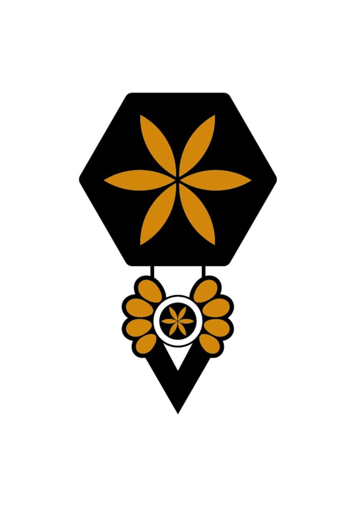
The idea for our logo developed during its creation. We invited the well-known artist to bring our vision to life.
We wanted the logo to reflect both the Podhale region and evoke
associations with honey, beekeeping, and ecology, while also fitting the concept of our rental houses/homes development.
We had many ideas, but ultimately we chose the one you see on our profile. Among all the proposals, this one felt the most fitting.
What Our Logo Represents
- Honeycomb Symbol: This element references beekeeping, honey, and bee products, linking directly to the name of our development—Miodowe Domki (Honey Homes).
- Rosette in the Center: This design element draws on traditional Podhale ornaments and symbolizes
the flowers from which bees gather nectar.
- Traditional Parzenica: This motif is attached to the honeycomb, reflecting Podhale traditions, as our eco-friendly tourist homes were established in Murzasichle, the heart of Podhale. Our parzenica is intentionally unique, distinguishing our development.
- Knocker Shape: The logo’s form reminds us of a door knocker, symbolizing a welcoming gesture. We may even hang similar knockers on the doors of our homes in the future.
The golden color of the logo evokes the warm hue of honey.
We’d Love Your Thoughts!
We are curious to hear your opinions on the logo.
Additionally, we aimed for the logo to be artistic and adaptable for carving or imprinting on wood, metal, glass, clay, fabric, and other materials. Therefore, the graphic includes outlines to assist craftsmen in their work
